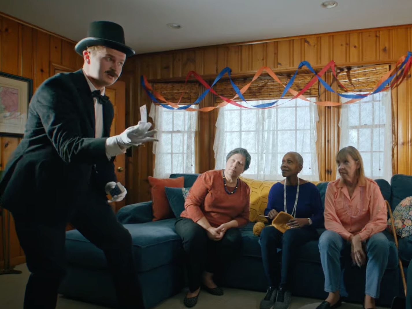
Working with Dominick on Forgive Me Father was an incredibly gratifying experience. To start, I color coded each of his characters based off of who they were in the story. This helped give an overarching cohesiveness in my production design and was incredibly fun to pitch.
To our protagonist, Father Sam, I assigned the color green. This isn’t only because the color green represents ordinary time in the liturgical year. I also chose green because green represents new experiences and growth. As any well-written protagonist does, Father Sam goes through changes in his story. So green felt like a given Father Sam’s love interest, Delilah, was given yellow/gold. Gold pairs very well with green and yellow represents happiness and idealism. Father Sam sees a possible relationship with Delilah and is tempted by her sunshine. To the antagonist, Father Jack, I assigned red. Red is classic for a villain, but also is found opposite green on the color wheel. Red was also the obvious choice because (SPOILER ALERT) Father Jack is closely associated with the devil who is iconically represented with the color red.
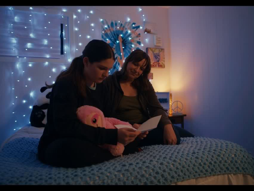
One of my favorite details which didn’t really make it’s way into frame is that when Father Sam has his bowl of chips on the couch, I chose corn tortilla chips that came in red, yellow, and green.
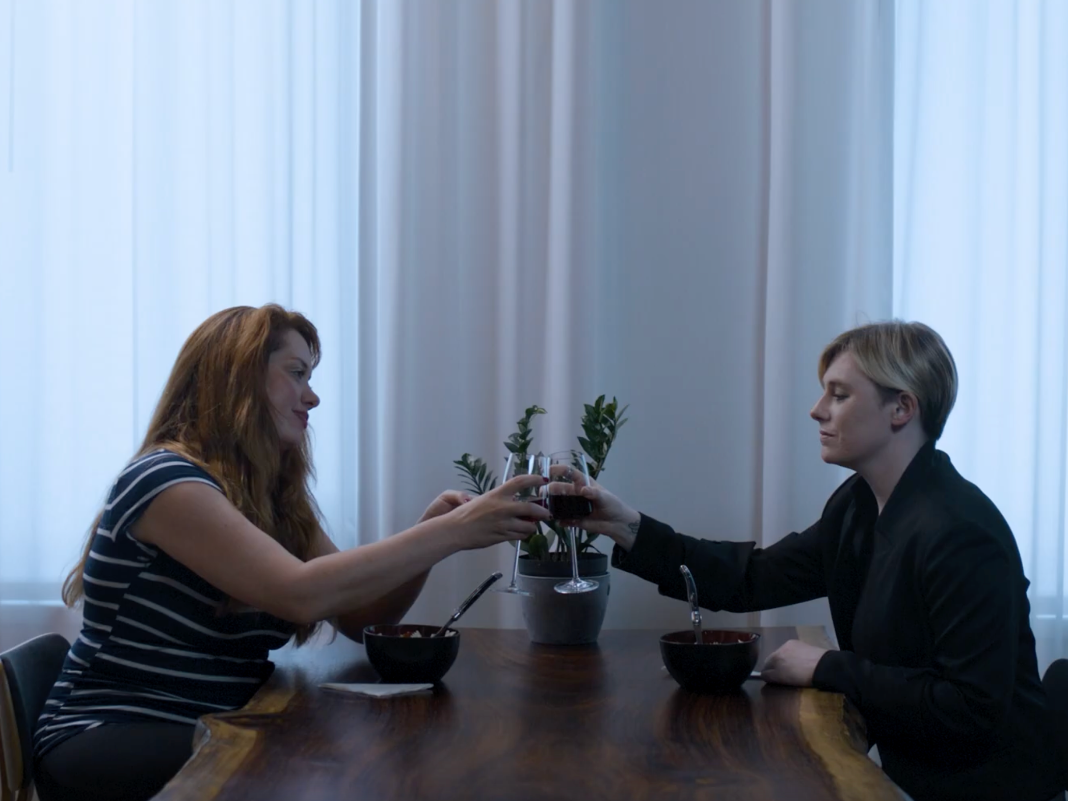
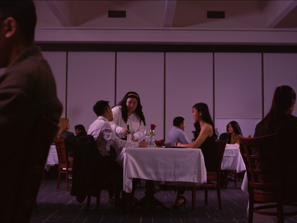
I had a team of three join me for what was arguably the most important art day on this project. I was tasked with turning an event room on the Montclair State University campus into a high brow restaurant. Once the director and I came up with said color scheme I incorporated it into the restaurant. Day of, I assigned each person a job and through factory-like procession we were able to create a restaurant atmisphere that I am very proud of.